Bivariate Statistics
In univariate statistics, we analyze a single variable at a time. Bivariate statistics extends this analysis to explore the relationship between two variables. By examining pairs of data, we can investigate patterns, determine the nature and strength of their relationship, and use this relationship to make pictions. This chapter focuses on the relationship between two quantitative variables.
Bivariate Variables
Definition Bivariate Data
Bivariate data consists of pairs of values for two quantitative variables, recorded for each individual in a dataset. We typically denote these variables as \((x, y)\), where:
- \(x\) is the independent (or explanatory) variable.
- \(y\) is the dependent (or response) variable.
Example
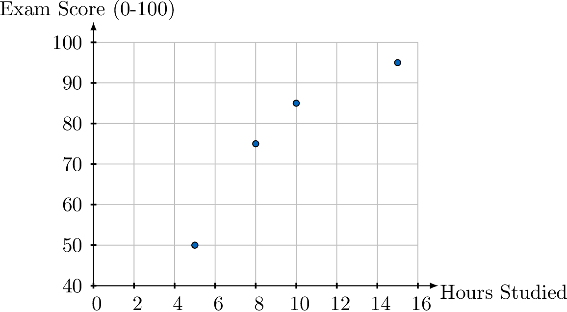
A teacher records the hours each student studied (\(x\)) and their final exam score (\(y\)).
| Hours Studied (\(x\)) | 5 | 10 | 8 | 15 |
| Exam Score (\(y\)) | 50 | 85 | 75 | 95 |
Scatter Plots
Definition Scatter Plot
A scatter plot is a graph that displays bivariate data as a collection of points in the Cartesian plane. The independent (explanatory) variable is plotted on the horizontal axis (\(x\)-axis), and the dependent (response) variable is plotted on the vertical axis (\(y\)-axis).
A scatter plot is the primary tool for visually identifying a potential relationship, or correlation, between two quantitative variables.
Method Constructing a Scatter Plot
- Identify Variables: Determine which variable is independent (\(x\)) and which is dependent (\(y\)).
- Set Up the Axes: Draw and label the horizontal axis for the \(x\)-variable and the vertical axis for the \(y\)-variable. Choose appropriate scales for both axes that cover the range of the data.
- Plot the Points: For each pair of (\(x, y\)) values in your dataset, plot a single point on the graph at the corresponding coordinates.
Example
A teacher recorded the number of hours students studied and their corresponding exam scores. The data is shown below:
| Hours Studied (\(x\)) | 5 | 10 | 8 | 15 |
| Exam Score (\(y\)) | 50 | 85 | 75 | 95 |
- Variables: "Hours Studied" is the independent variable (\(x\)) and "Exam Score" is the dependent variable (\(y\)).
- Axes: The x-axis will be labeled "Hours Studied" and the y-axis will be "Exam Score". The scales must accommodate the data ranges.
- Plot Points: We plot the four coordinate pairs: (5, 50), (10, 85), (8, 75), and (15, 95).
Correlation
Definition Correlation
Correlation describes the nature of the relationship between two quantitative variables.
Definition Direction: Positive or Negative
The direction describes the overall trend of the data.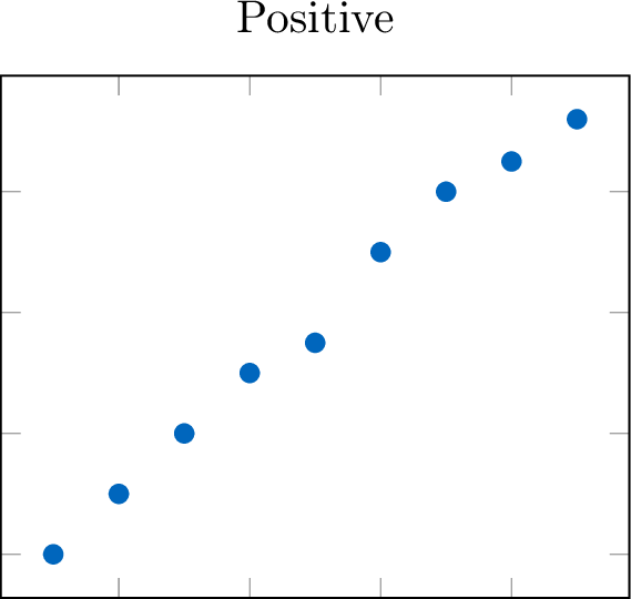 \quad
\quad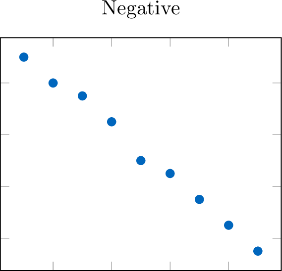
- Positive: As the independent variable (\(x\)) increases, the dependent variable (\(y\)) tends to increase. The points trend upward.
- Negative: As the independent variable (\(x\)) increases, the dependent variable (\(y\)) tends to decrease. The points trend downward.
\quad
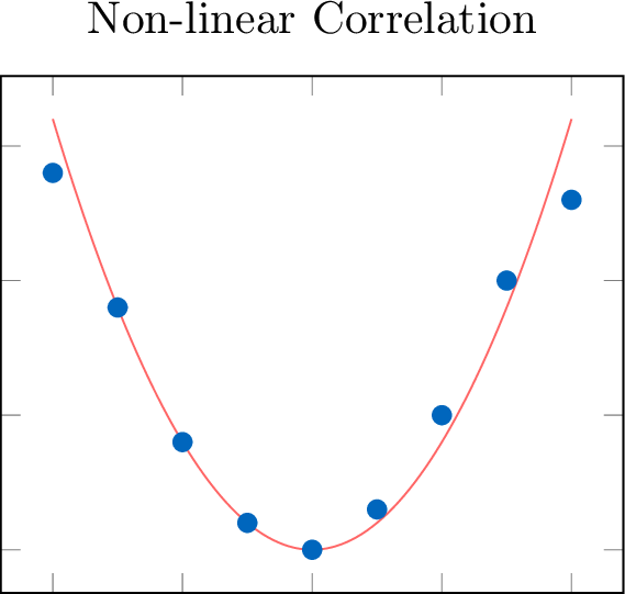
Definition Form: Linear or Non-linear
The form of the relationship is linear if the data points appear to follow a straight-line pattern. If they follow a curve other than a straight line, the form is non-linear.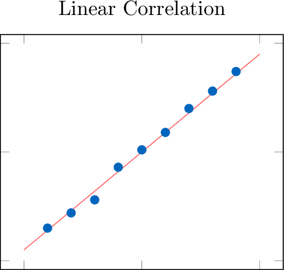
Definition Strength
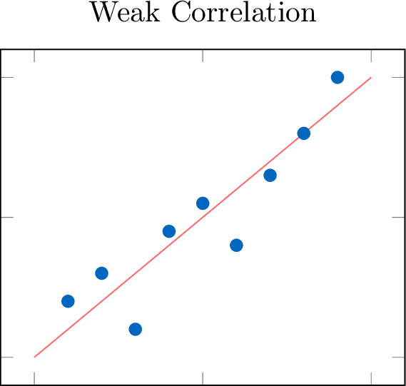
The strength of a correlation describes how closely the data points adhere to the identified form.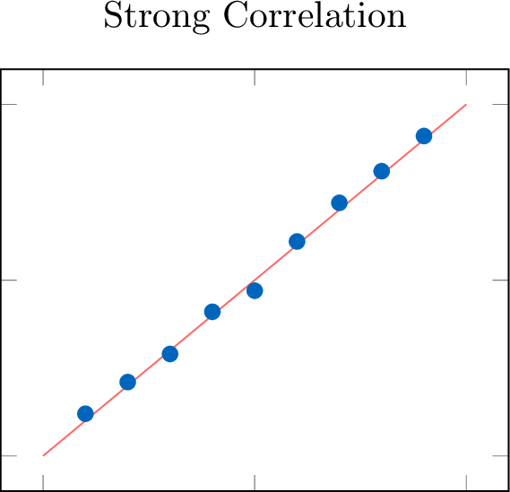
Definition Outliers
An outlier is a data point that deviates significantly from the main pattern of the data.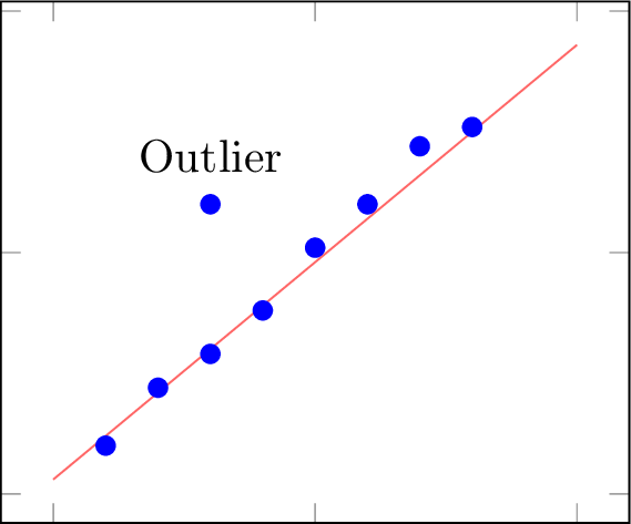
Method Describing a Correlation
When asked to describe the relationship shown in a scatter plot, you should always comment on all four features in a concise statement.
- Direction: Is it positive or negative?
- Form: Is it linear or non-linear?
- Strength: Is it strong, moderate, or weak?
- Outliers: Are there any notable outliers?
Example
Describe the correlation between hours studied and exam scores shown in this scatter plot.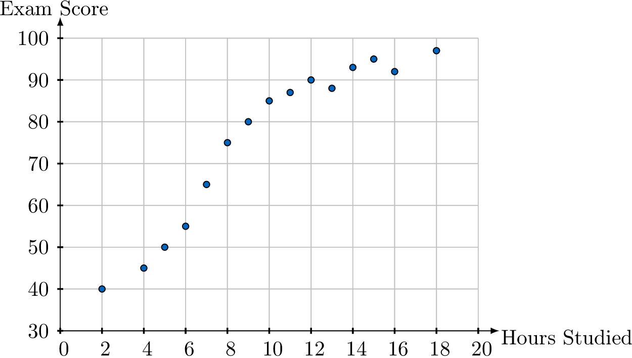
There appears to be a strong, positive, linear correlation between hours studied and exam scores. As the number of hours studied increases, the exam score tends to increase in a straight-line pattern. There are no obvious outliers.
Correlation vs. Causation
Correlation Does Not Imply Causation
Observing a statistical relationship (correlation) between two variables, \(x\) and \(y\), is not sufficient evidence to conclude that a change in \(x\) causes a change in \(y\).
Definition Causation
Causation exists only if a change in the independent variable is shown to directly cause a change in the dependent variable. Proving causation requires a carefully designed controlled experiment, not just observational data.
Definition Confounding Variable
Often, a correlation between two variables (\(x\) and \(y\)) is actually caused by a third, unobserved factor known as a confounding variable (\(z\)). This variable influences both \(x\) and \(y\), creating an apparent but misleading relationship between them.
Example
Data shows a strong positive correlation between ice cream sales and the number of people who get sunburned.
Does this mean eating ice cream causes sunburn? If not, identify the relationships and the likely confounding variable.
Does this mean eating ice cream causes sunburn? If not, identify the relationships and the likely confounding variable.
No, eating ice cream does not cause sunburn.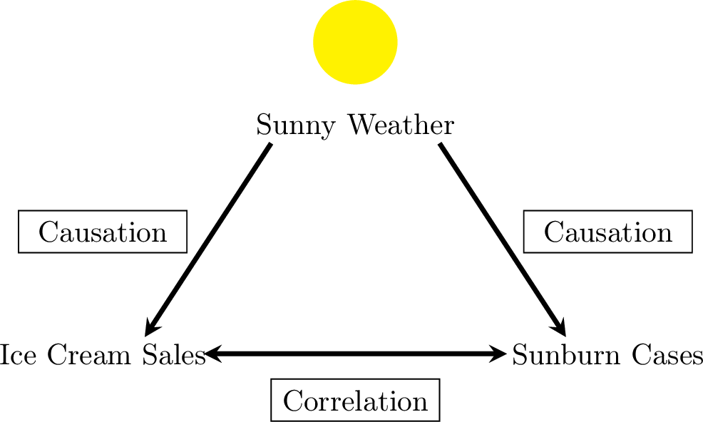
- The relationship between ice cream sales and sunburn cases is a correlation, not causation.
- The likely confounding variable is Sunny Weather. Hot and sunny days cause an increase in ice cream sales and also cause an increase in people getting sunburned.
Measuring Linear Correlation
While scatter plots allow us to visually describe a correlation, this assessment is subjective. To provide a precise and objective measure of the strength and direction of a linear relationship, we use numerical coefficients.
Definition Pearson's Correlation Coefficient (\(r\))
The Pearson's correlation coefficient (\(r\)) is a value in the range \([-1, 1]\) that quantifies the direction and strength of a linear relationship between two quantitative variables.
- The sign of \(r\) indicates the direction (positive or negative).
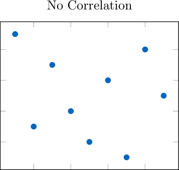
- The magnitude (absolute value) of \(r\) indicates the strength. An \(|r|\) value close to 1 implies a strong linear correlation, while a value close to 0 implies a weak or no linear correlation.
| Value of \(|r|\) | Strength of Correlation |
| \(|r| = 1\) | Perfect |
| \(0.9 \le |r| < 1\) | Very Strong |
| \(0.7 \le |r| < 0.9\) | Strong |
| \(0.5 \le |r| < 0.7\) | Moderate |
| \(0.3 \le |r| < 0.5\) | Weak |
| \(0 \le |r| < 0.3\) | Very Weak or None |
Definition Coefficient of Determination (\(r^2\))
The coefficient of determination (\(r^2\)) is the square of the correlation coefficient. It is a value in the range \([0, 1]\) and is typically expressed as a percentage.
The value of \(r^2\) represents the proportion of the variance in the dependent variable (\(y\)) that is predictable from the independent variable (\(x\)). In simple terms, it tells us how well the linear model fits the data.
The value of \(r^2\) represents the proportion of the variance in the dependent variable (\(y\)) that is predictable from the independent variable (\(x\)). In simple terms, it tells us how well the linear model fits the data.
Example
A study of hours spent studying and exam scores finds a correlation coefficient of \(r = 0.9\).
Interpret both \(r\) and \(r^2\).
Interpret both \(r\) and \(r^2\).
- Interpretation of \(r\): Since \(r=0.9\), there is a very strong, positive, linear correlation between the hours spent studying and the exam scores.
- Interpretation of \(r^2\): We calculate \(r^2 = (0.9)^2 = 0.81\). This means that 81\(\pourcent\) of the variation in the exam scores can be explained by the linear relationship with the number of hours spent studying. The remaining 19\(\pourcent\) is due to other factors (e.g., natural ability, quality of sleep, etc.).
Linear Regression
When a scatter plot indicates a linear correlation between two variables, we can model this relationship using a straight line. This line, known as the regression line, can be used to make predictions. The reliability of this model is often assessed using the coefficient of determination (\(r^2\)). A high \(r^2\) value indicates that a large proportion of the variance in the dependent variable is explained by the independent variable, suggesting the linear model is a good fit for the data.
Definition Least Squares Regression Line
The least squares regression line, written as \(y = ax + b\), is the unique line of best fit that models the linear relationship between \(x\) and \(y\). It is calculated by minimizing the sum of the squares of the residuals.
A residual is the vertical distance between an observed data point \((x_i, y_i)\) and the predicted point on the regression line \((x_i, \hat{y}_i)\).$$ \text{Residual} = \text{observed } y - \text{predicted } y = y_i - \hat{y}_i $$A key property is that the least squares regression line always passes through the point of means, \((\bar{x}, \bar{y})\).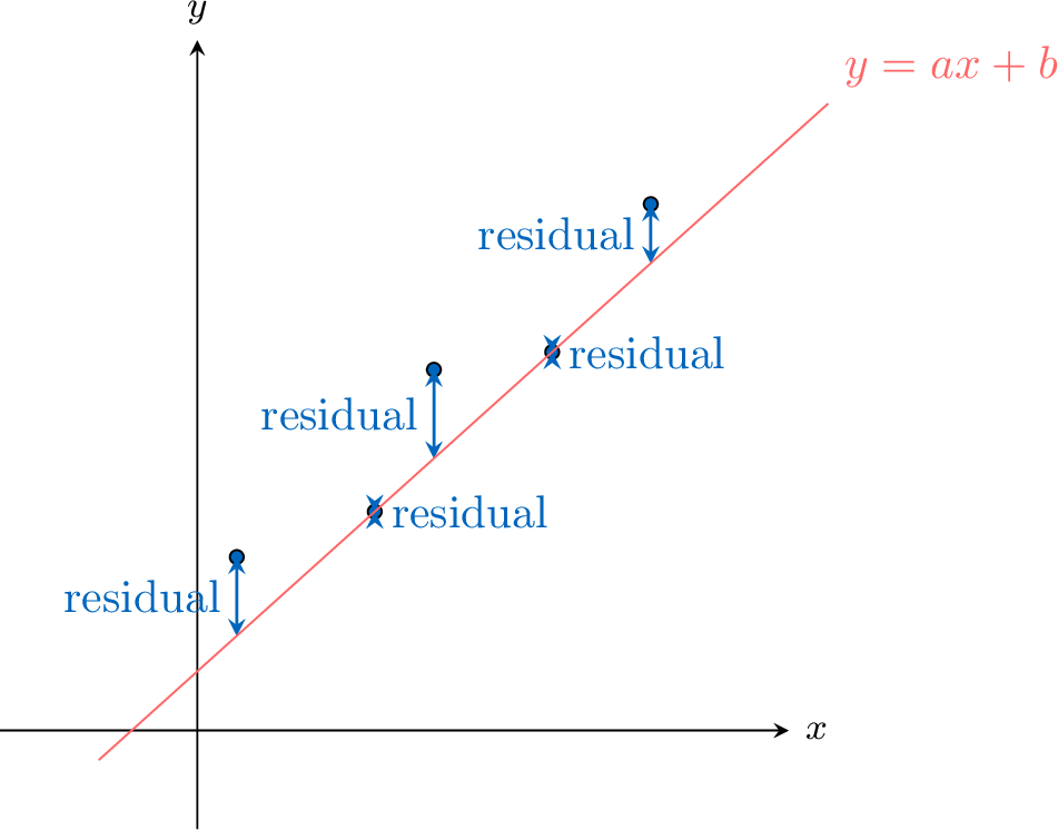
A residual is the vertical distance between an observed data point \((x_i, y_i)\) and the predicted point on the regression line \((x_i, \hat{y}_i)\).$$ \text{Residual} = \text{observed } y - \text{predicted } y = y_i - \hat{y}_i $$A key property is that the least squares regression line always passes through the point of means, \((\bar{x}, \bar{y})\).
Definition Interpolation and Extrapolation
The regression line can be used to make predictions:
- Interpolation is the process of predicting a \(y\)-value for an \(x\)-value that is within the range of the original data. If the correlation is strong, interpolation is generally considered reliable.
- Extrapolation is the process of predicting a \(y\)-value for an \(x\)-value that is outside the range of the original data. Extrapolation is generally considered unreliable, as we cannot assume the linear trend continues indefinitely.
Example
For the "Hours Studied vs. Exam Score" data, a a graphing calculator calculates the regression line to be \(y = 3.5x + 40\). The data for hours studied ranged from 2 to 18 hours.
- Predict the exam score for a student who studied for 11 hours.
- Predict the exam score for a student who studied for 25 hours.
- Comment on the reliability of the prediction in part (b).
- Since \(x=11\) is within the data range, this is interpolation. $$ y = 3.5(11) + 40 = 38.5 + 40 = 78.5 $$ The predicted score is 78.5.
- Since \(x=25\) is outside the data range, this is extrapolation. $$ y = 3.5(25) + 40 = 87.5 + 40 = 127.5 $$ The predicted score is 127.5.
- The prediction in part (b) is unreliable. It is an extrapolation, and we cannot assume the linear relationship holds for 25 hours of study. Furthermore, the model predicts a score over 100, which is impossible in this context, highlighting the danger of extrapolation.