Statistics
Statistical Investigation Process
Statistics are all around us, from sports averages to news reports about the weather.
- A basketball player averages 14.6 points per game.
- Last year was the hottest year on record since 1897.
Definition Statistics
Statistics is the science of designing investigations and then collecting, organizing, analyzing, and interpreting data to answer a specific question.
Method Statistical Investigation Process
A statistical investigation follows these five key steps:
- Pose the Question: Define clearly what you want to investigate.
- Collect Data: Gather information relevant to your question.
- Analyze Data: Calculate summary statistics, such as frequencies, means, or modes.
- Represent Data: Display the organized data visually using graphs and charts.
- Interpret Data: Draw conclusions to answer your question.
Step 1: Posing the Question
Definition Statistical Problem
A statistical problem is a clear, focused question that can be answered by collecting and analyzing data.
Example
Let's investigate the problem: "What is the favorite school subject of students at our school?"
Definition Population
A population is the entire group of people or things that you want to study.
Example
For our problem, the population is all students at our school.
Definition Data
Data is the information we collect, like numbers, words, measurements, or observations.
Example
The data we collect will be the list of answers from each student, such as "Math", "Art", "Science", "Art", "Sport", etc.
Definition Types of Variables
Data can be described by different types of variables:
- Qualitative variable (categorical): Describes a quality or category. The possible answers are words or labels. Think: "What kind?" (e.g., eye color, favorite food).
- Quantitative variable (numerical): Describes a quantity or number that can be counted or measured. Think: "How many?" or "How much?" (e.g., height, number of siblings).
Example
For our survey:
- The variable "Favorite Subject" is qualitative because the answers are categories (Math, Art, etc.).
- The variable "How many hours do you do homework per week?" is quantitative because the answer will be a number that can be measured (e.g., 2 hours, 5 hours).
Step 2: Collecting Data
When we conduct an investigation, we must decide who to collect data from. Do we ask everyone in the population, or just a smaller group?
Definition Census vs. Survey
- A census collects data from every single member of the population. It is accurate but can be very slow and expensive for large populations.
- A survey (or sampling) collects data from a smaller, manageable group taken from the population, called a sample. It is much faster, but the sample must be chosen carefully to be representative of the whole population.
Example
An investigation asks: "What is the favorite subject of students at this school?"
If you ask every student in the school, is it a census or a survey?
If you ask every student in the school, is it a census or a survey?
It is a census because you are collecting data from the entire population (all students in the school).
Example
An investigation asks: "What is the favorite subject of students at this school?"
If you only ask the students in your math class, is it a census or a survey?
If you only ask the students in your math class, is it a census or a survey?
It is a survey because you are only collecting data from a small sample (your math class) of the total population (the whole school).
Method Collecting and Recording Survey Data
Once you have your question and have identified your population, you need a systematic way to collect and record the answers. For a census of a small group (like your class), a tally table is an efficient tool.
- Prepare a Tally Table: Before you start, create a table with a column for each possible answer category and a column for tally marks.
- Conduct the Survey: Ask each person in your population the survey question one by one.
- Record Each Answer: For each answer you receive, place one tally mark
 in the row for the corresponding category. Remember to make the fifth mark a diagonal line across the first four
  to make counting easier.
Example
Collecting data for the question "What is your favorite school subject?"
As you survey each of the 25 students, you would fill out the tally column. After asking all 25 students, your tally table would look like this:
As you survey each of the 25 students, you would fill out the tally column. After asking all 25 students, your tally table would look like this:
| Subject | Tally Marks |
| Math | |
| Science | |
| Sport | |
| Art | |
Step 2: Collecting Data (Error in Sampling)
One of the most common ways to collect information about a large group is to use a sample. For a sample to be meaningful, it must fairly represent the entire population. Two key challenges in sampling are avoiding bias and choosing a sample size that is large enough to capture the population’s diversity.
- Selection bias: A famous example of biased sampling is the Literary Digest poll before the 1936 U.S. presidential election. The magazine sent millions of surveys using telephone books and car registration lists. But during the Great Depression, many people couldn’t afford phones or cars. This led to a sample heavily biased toward wealthier citizens, who at the time were more likely to vote Republican. Because of this bias, the poll incorrectly predicted a landslide win for Alfred Landon, while Franklin D. Roosevelt actually won by a wide margin.
- Sample size: During the Cuban Missile Crisis of 1962, U.S. intelligence underestimated the number and types of Soviet missiles in Cuba because they had only a limited amount of reconnaissance data. The small “sample” of photos covered only part of the island, so several launch sites, including some with longer-range missiles, were initially missed. Although this was not a statistical survey, it illustrates how having too little data (a very small or incomplete sample) can lead to serious errors in judgment, especially when the stakes are high.
Definition Sampling Error
Sampling error is the natural, expected difference between a statistic calculated from a sample and the true value for the entire population. It exists simply because a sample is a part of the whole, not the whole itself, and because the individuals chosen by chance will never match the population perfectly.
Definition Selection Bias
Selection bias is a systematic error that occurs when the method of selecting a sample causes it to be unrepresentative of the population. Unlike random sampling error, bias pushes the results in a specific direction and does not disappear just by increasing the sample size.
Example
An investigation asks: "What is the favorite subject of students at this school?" To collect data, you survey only the students in your math class.
This is a biased sample.
This is a biased sample.
- The Population is all students in the entire school.
- The Sample is only the students in your specific math class.
Method Reducing Error in Sampling
To ensure a survey's results are as accurate as possible, statisticians use two main strategies:
- Use Random Sampling: To avoid selection bias, every member of the population should have an equal chance of being chosen for the sample. This is the foundation of reliable surveying.
- Increase the Sample Size: As the sample size gets larger, it is more likely to accurately reflect the diversity of the population, and the random sampling error generally decreases. However, increasing the sample size alone does not remove selection bias if the method of selection is already flawed.
Step 3: Analyzing Data (Frequency)
Definition Frequency and Relative Frequency
Frequency (or count) is how many times each category appears in our data.
Relative frequency is the proportion of the data that falls into a category. We can write it as a fraction, a decimal, or a percentage.$$ \text{Relative frequency (in }\pourcent\text{)} = \frac{\text{Frequency}}{\text{Total number of data values}} \times 100\pourcent $$
Relative frequency is the proportion of the data that falls into a category. We can write it as a fraction, a decimal, or a percentage.$$ \text{Relative frequency (in }\pourcent\text{)} = \frac{\text{Frequency}}{\text{Total number of data values}} \times 100\pourcent $$
Example
Let's calculate the relative frequency for our "Favorite Subject" survey of 25 students:
| Subject | Frequency | Relative Frequency |
| Math | 8 | \(8/25\times 100\pourcent = 32\pourcent\) |
| Science | 5 | \(5/25\times 100\pourcent = 20\pourcent\) |
| Sport | 7 | \(7/25\times 100\pourcent = 28\pourcent\) |
| Art | 5 | \(5/25\times 100\pourcent = 20\pourcent\) |
| Total | 25 | 100\(\pourcent\) |
Step 3: Analyzing Data (Central Tendency)
Definition Measures of Central Tendency
A measure of central tendency is a single value that attempts to describe a set of data by identifying the central position within that set. The main measures are the mean, median, and mode.
Definition Mode
The mode is the value or category that appears most frequently. A dataset can have more than one mode.
Example
The results of the "Favorite Subject" survey are shown in the frequency table below.
| Subject | Frequency |
| Math | 8 |
| Science | 5 |
| Sport | 7 |
| Art | 5 |
The mode is the category with the highest frequency. By looking at the table, the highest frequency is 8.
The subject corresponding to this frequency is Math. Therefore, the mode is Math. This means it is the favorite subject.
The subject corresponding to this frequency is Math. Therefore, the mode is Math. This means it is the favorite subject.
Definition Mean
The mean is the sum of all numerical values divided by the count of values. It is often called the "average."$$\begin{aligned} \bar{x} &= \frac{\text{sum of all values}}{\text{number of values}} \\
&= \frac{x_1 + x_2 + x_3 + \dots + x_n}{n}\end{aligned}$$
Example
For the dataset \(1, 4, 2, 3, 5, 4, 5, 4, 4\), what is the mean?
$$ \text{Mean} = \frac{1 + 4 + 2 + 3 + 5 + 4 + 5 + 4 + 4}{9} = \frac{32}{9} \approx 3.56 $$
Definition Median
The median is the middle value of a dataset that has been ordered from least to greatest.
- If there is an odd number of values, the median is the single middle value.
- If there is an even number of values, there are two middle values and the median is the mean of these two values.
Example
For the dataset \(1, 4, 2, 3, 5, 4, 5, 4, 4\), what is the median?
- Order the data: \(1, 2, 3, 4, 4, 4, 4, 5, 5\).
- Find the middle value: There are 9 values (an odd number), so the middle value is the 5th one. $$1, 2, 3, 4, \underline{4}, 4, 4, 5, 5$$
Step 3: Analyzing Data (Spread)
Definition Measures of Spread (Dispersion)
A measure of spread (or dispersion) describes how varied or "spread out" the values in a dataset are. While central tendency tells us about the center, spread tells us about the consistency of the data. The main measures are the range, interquartile range (IQR), and standard deviation.
Example
Consider the test scores of two students:
- Student A's scores: 10, 50, 90
- Student B's scores: 45, 50, 55
Definition Range
The range is the difference between the maximum and minimum values in a dataset. It gives a quick measure of the total spread.$$ \text{Range} = \text{Maximum Value} - \text{Minimum Value} $$
Example
Find the range for the data: \(1, 19, 10, 2, 18, 10, 5, 15, 10\).
The minimum value is 1 and the maximum is 19.
The range is \(19 - 1 = 18\).
The range is \(19 - 1 = 18\).
Definition Quartiles and IQR
Quartiles are values that divide an ordered dataset into four equal parts.
The interquartile range (IQR) is the range of the middle 50\(\pourcent\) of the data. It is less affected by extreme outliers than the range.$$ \text{IQR} = Q_3 - Q_1 $$
- The lower quartile (Q1) is the median of the lower half of the data.
- The median (Q2) is the overall median of the data.
- The upper quartile (Q3) is the median of the upper half of the data.
The interquartile range (IQR) is the range of the middle 50\(\pourcent\) of the data. It is less affected by extreme outliers than the range.$$ \text{IQR} = Q_3 - Q_1 $$
Example
Find the quartiles and the interquartile range for the data: \(1, 19, 10, 2, 18, 10, 5, 15, 10\).
- Order the data: \(1, 2, 5, 10, 10, 10, 15, 18, 19\).
- Find the median (Q2): The middle value is the 5th one, so \(Q_2 = 10\). $$ 1, 2, 5, 10, \underline{10}, 10, 15, 18, 19 $$
- Split the data into two halves (excluding Q2): Lower half: \(1, 2, 5, 10\) \quad Upper half: \(10, 15, 18, 19\).
- Find the lower quartile (Q1): Find the median of the lower half. $$ 1, \underline{2, 5}, 10 \rightarrow Q_1 = \frac{2+5}{2} = 3.5 $$
- Find the upper quartile (Q3): Find the median of the upper half. $$ 10, \underline{15, 18}, 19 \rightarrow Q_3 = \frac{15+18}{2} = 16.5 $$
- Calculate the IQR: $$ \text{IQR} = Q_3 - Q_1 = 16.5 - 3.5 = 13 $$
The most powerful measure of spread is the standard deviation. It measures the average distance of each data point from the mean. A small standard deviation means the data points are clustered closely around the mean (like Student B), while a large standard deviation means the data is spread out (like Student A).
Definition Standard Deviation
The standard deviation (\(\sigma\)) is found by taking the square root of the average of the squared differences from the mean.$$\sigma = \sqrt{\frac{\sum_{i=1}^{n}(x_i - \bar{x})^2}{n}}$$where \(\bar{x}\) is the mean and \(n\) is the number of data points.
Example
Find the standard deviation for the data: $$2, 4, 4, 4, 5, 5, 7, 9$$
- Find the mean (\(\bar{x}\)): $$ \bar{x} = \frac{2 + 4 + 4 + 4 + 5 + 5 + 7 + 9}{8} = \frac{40}{8} = 5 $$
- Calculate the squared differences from the mean: \((2-5)^2 = 9\), \((4-5)^2 = 1\), \((4-5)^2 = 1\), \((4-5)^2 = 1\), \((5-5)^2 = 0\), \((5-5)^2 = 0\), \((7-5)^2 = 4\), \((9-5)^2 = 16\).
- Find the average of the squared differences (the variance): $$ \frac{9 + 1 + 1 + 1 + 0 + 0 + 4 + 16}{8} = \frac{32}{8} = 4 $$
- Take the square root to find the standard deviation (\(\sigma\)): $$ \sigma = \sqrt{4} = 2 $$
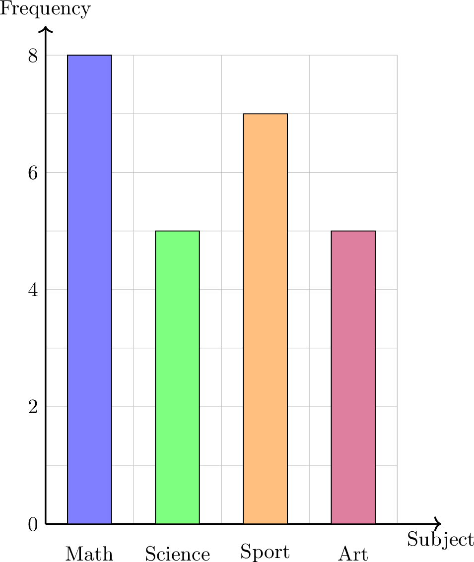
Step 4: Representing Data (Bar Charts)
Once data is organized in a table, we can create graphs to see the patterns visually. Bar charts are excellent for comparing frequencies, while pie charts are best for showing proportions.
Definition Bar Chart
A bar chart uses rectangular bars where the height of each bar represents its frequency. It can be used for both qualitative and quantitative data.
- For qualitative (categorical) data, each bar represents a distinct category (e.g., "Math", "Science"). The bars are typically drawn with gaps between them to show the categories are separate.
- For quantitative (numerical) data, each bar represents a specific number (e.g., a score of "3", or "4 siblings"). The numbers are placed in order along the horizontal axis.
Example
Draw a bar chart for our "Favorite Subject" survey data.
| Subject | Frequency |
| Math | 8 |
| Science | 5 |
| Sport | 7 |
| Art | 5 |
Definition Pie Chart
A pie chart shows the proportion of each category as a slice of a circle. If the relative frequency of a category is written as a decimal (for example \(0.32\)), the angle for its slice is calculated as:$$ \text{Angle} = \text{Relative Frequency} \times 360^\circ. $$
Example
Draw a pie chart for our "Favorite Subject" survey data (Total = 25 students).
| Subject | Frequency | Relative Frequency |
| Math | 8 | \(32\pourcent\) |
| Science | 5 | \(20\pourcent\) |
| Sport | 7 | \(28\pourcent\) |
| Art | 5 | \(20\pourcent\) |
First, calculate the angle for each slice: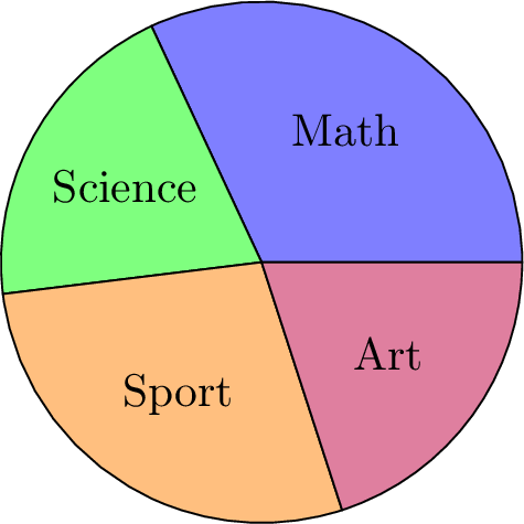
- Math: \(0.32 \times 360^\circ \approx 115^\circ\)
- Science: \(0.20 \times 360^\circ = 72^\circ\)
- Sport: \(0.28 \times 360^\circ \approx 101^\circ\)
- Art: \(0.20 \times 360^\circ = 72^\circ\)
Step 4: Representing Data (Box Plots)
While measures like the mean and standard deviation are powerful, they don't give a full picture of the data's distribution. A box plot (or box-and-whisker plot) is a visual tool that summarizes a dataset by showing both its center and its spread simultaneously.
Definition Box Plot
A box plot visually displays the five-number summary above a number line.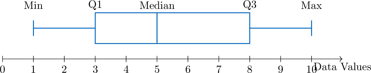
- A central box is drawn from the lower quartile (Q1) to the upper quartile (Q3).
- A line inside the box marks the median (Q2).
- Whiskers (lines) extend from the box out to the minimum and maximum values.
Method Constructing a Box Plot
- Order the data from least to greatest.
- Find the five-number summary: Calculate the minimum, Q1, median, Q3, and maximum.
- Draw a number line that covers the full range of your data.
- Draw the box and median: Draw a box from Q1 to Q3 and a vertical line inside the box at the median.
- Draw the whiskers: Draw lines from the box to the minimum and maximum values.
Example
This box plot shows the number of minutes passengers spent waiting in an airport departure lounge.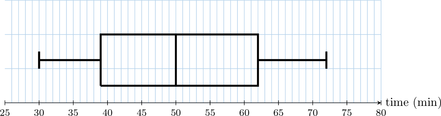
By reading the five-number summary from the plot:
- Median (Q2): The line inside the box is at 50 minutes.
- Range: Maximum - Minimum = \(72 - 30 = 42\) minutes.
- Interquartile Range (IQR): Q3 - Q1 = \(62 - 39 = 23\) minutes.
Step 5: Interpreting Data
Method A Method for Interpreting Data
Interpretation is the final and most important step. It’s where you explain the story your data tells. Follow these steps to write a strong interpretation.
- State the Main Findings: Start by describing the most obvious points. What is the most popular category (the mode)? What is the least popular?
- Make Comparisons: Use comparative words (e.g., "more than," "less than," "twice as many") to compare different categories. Perform simple calculations if needed.
- Use Specific Data as Evidence: Support your statements with numbers. Use frequencies (counts) or relative frequencies (percentages) from your table or chart.
- Draw a Conclusion: Write a concluding sentence that directly answers your original statistical question.
- Reflect and Ask New Questions: Think about what your data doesn't tell you. Does this result apply to the whole school, or just your class? What could you investigate next?
Example Interpreting the "Favorite Subject" Survey
Let's apply the 5-step method to interpret the results from our survey on favorite subjects.
| Subject | Frequency | Relative Frequency |
| Math | 8 | \(32\pourcent\) |
| Science | 5 | \(20\pourcent\) |
| Sport | 7 | \(28\pourcent\) |
| Art | 5 | \(20\pourcent\) |
- Main Findings: The data shows that Math is the most popular subject. The least popular subjects are Science and Art, which are tied.
- Comparisons: More students chose Math (8) than Sport (7). The number of students who prefer Science is the same as the number who prefer Art (5).
- Evidence: Math is the favorite for 32\(\pourcent\) of the class, making it the clear mode.
- Conclusion: In conclusion, based on our survey of 25 students, the favorite subject in this class is Math.
- Reflection: This conclusion only applies to our class of 25 students. A new question for a future investigation could be: "Is Math also the favorite subject in the entire school?"
Method Thinking Critically About Statistical Claims
Whenever you encounter a claim based on statistics (e.g., in the news or an advertisement), you must evaluate it critically. A good statistician considers two key points:
- Question the Data Collection: All sample statistics contain potential error. Always ask:
- Was the sample representative of the population, or was it biased?
- Was the sample size large enough to be reliable?
- What is the potential for sampling error?
- Avoid Overgeneralization: Statistics describe group trends, not absolute truths about individuals. It is a common misuse of statistics to apply a group average to every member of that group.
Example
- Claim: "Girls are better at math than boys."
- Evidence Provided: In my class, the girls' mean test score was \(87\pourcent\), while the boys' mean was \(75\pourcent\).
- Critical Evaluation: Although the data shows that girls performed better on average in this specific class, the broad generalization is flawed.
- Limitation of the Sample: The sample size (a single class) is too small to be representative of the entire student population. Therefore, this finding cannot be generalized to all girls and boys.
- Corrected Conclusion: A more accurate statement would be: "In this particular class, the girls' average score was higher than the boys' average score."