Statistics
Statistical Inquiry
Have you ever wondered which pet is the most popular in our class, or which ice cream flavor most students like best? When we ask questions like these to find out more about our world, we are doing statistics!
Statistics helps us be data detectives. We collect clues (called data) and use them to answer our big questions and understand what is happening.
Statistics helps us be data detectives. We collect clues (called data) and use them to answer our big questions and understand what is happening.
Definition Statistics
Statistics is when we ask questions, collect answers (our data, the pieces of information we get), and then organize this data to discover interesting things and tell a story about it.
Let's imagine our class wants to investigate the question: "What is our favorite school subject?" We will survey all 25 students in the class.
Definition Population
A population is the entire group of people or things that you want to study.
Example
For our survey, the population is all 25 students in our class.
Definition Data
Data is the information we collect, like numbers, words, measurements, or observations.
Example
The data we collect will be the list of answers from each student, such as "Math", "Art", "Science", "Art", "Sport", etc.
Definition Types of Variables
Data can be described by different types of variables:
- Qualitative variable (categorical): Describes a quality or category. The possible answers are words or labels. Think: "What kind?" (e.g., eye color, favorite food).
- Quantitative variable (numerical): Describes a quantity or number that can be counted or measured. Think: "How many?" or "How much?" (e.g., height, number of siblings).
Example
For our survey:
- The variable "Favorite Subject" is qualitative because the answers are categories (Math, Art, etc.).
- The variable "How many hours do you do homework per week?" is quantitative because the answer will be a number that can be measured (e.g., 2 hours, 5 hours).
Organizing and Analyzing Data
Definition Frequency and Relative Frequency
Frequency (or count) is how many times each category appears in our data.
Relative frequency is the proportion of the data that falls into a category. We can write it as a fraction, a decimal, or a percentage.$$ \text{Relative frequency (in }\pourcent\text{)} = \frac{\text{Frequency}}{\text{Total number of data values}} \times 100\pourcent $$
Relative frequency is the proportion of the data that falls into a category. We can write it as a fraction, a decimal, or a percentage.$$ \text{Relative frequency (in }\pourcent\text{)} = \frac{\text{Frequency}}{\text{Total number of data values}} \times 100\pourcent $$
Method Creating a Frequency Table
To organize our data, we use a frequency table. We use tally marks to count the frequency for each category. Then, we can calculate the relative frequency.
Let's organize the data for our "Favorite Subject" survey of 25 students:
Let's organize the data for our "Favorite Subject" survey of 25 students:
| Subject | Tally Marks | Frequency (Count) | Relative Frequency |
| Math | | 8 | \(8/25 = 32\pourcent\) |
| Science | | 5 | \(5/25 = 20\pourcent\) |
| Sport | | 7 | \(7/25 = 28\pourcent\) |
| Art | | 5 | \(5/25 = 20\pourcent\) |
| Total | 25 | 100\(\pourcent\) |
Representing Data Visually
Definition Bar Chart
A bar chart (or bar graph) represents data using rectangular bars. The height of each bar shows the amount or total number for that category. The categories are written along one axis, and the numbers are shown along the other axis. Bar charts are excellent for comparing different groups quickly.
Example
Here is a bar chart showing the data from our "Favorite Subject" frequency table. It helps us see the results at a glance.
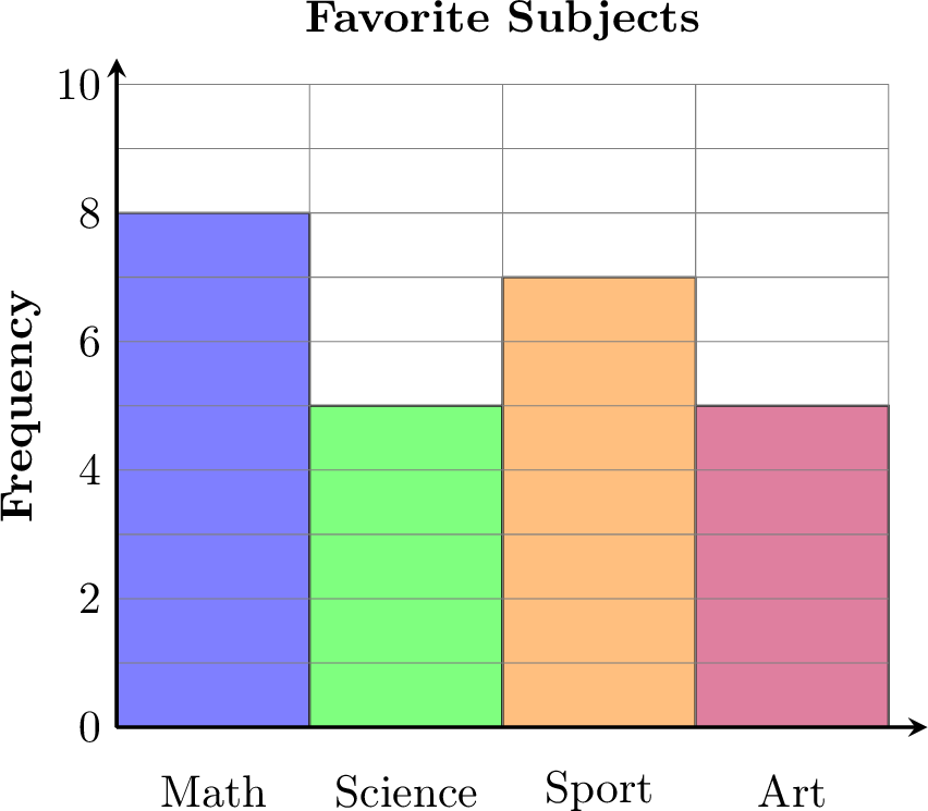
| Subject | Frequency |
| Math | 8 |
| Science | 5 |
| Sport | 7 |
| Art | 5 |