Statistics
Collecting Data
Have you ever wondered which pet is the most popular in our class, or which ice cream flavor most students like best? When we ask questions like these to find out more about our world, we are doing statistics!
Statistics helps us be data detectives. We collect clues (called data) and use them to answer our big questions and understand what is happening.
Statistics helps us be data detectives. We collect clues (called data) and use them to answer our big questions and understand what is happening.
Definition Statistics
Statistics is when we ask questions, collect answers (our data, the pieces of information we get), and then organize this data to discover interesting things and tell a story about it.
Definition Data
Data is the information we collect, like numbers, words, measurements, or observations.
Method Our Plan for Collecting Data
To be a good data detective, you need a clear plan! Here’s one way we can collect data.
- Ask a Clear Question: Start with something you want to know. For example: « What is your favorite pet? » Everyone should understand the question and be able to answer it.
- Gather Your Answers: Ask your classmates the same question, one by one, so that everyone answers once.
- Record the Data with Tally Marks: A tally mark is a quick way to write down “one”. For every answer, you draw one line. When you get to five, you draw a line across the first four. This makes it easy to count and check your total later.
| Pet | Tally Marks | Total |
| Dog | | 5 |
| Cat | | 4 |
| Fish | | 2 |
Representing and Reading Data
Once we have collected our data using tally marks, we need a clear way to show what we have found. Graphs help us turn our numbers into a picture, making it easier to understand and share our discoveries!
Definition Picture Graph
A picture graph (or pictograph) is a chart that uses pictures to show how many of something there are. Each picture stands for one object (or more, if we say so). It helps us see and count easily!
Example
Let’s look at the fruits in the box and make a picture graph!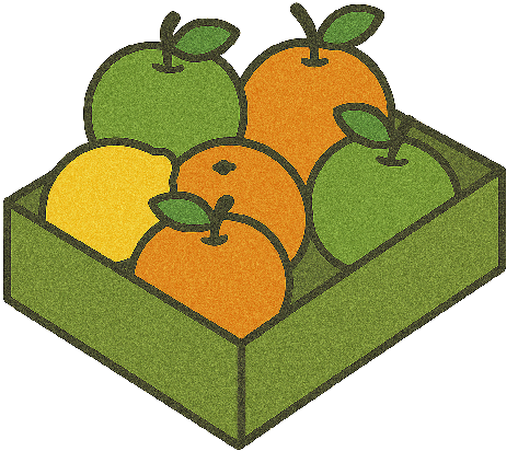
Our Fruit Picture Graph
| 3 |  | ||
| 2 | |  | |
| 1 |  | | |
| Lemon | Orange | Apple |
Our Fruit Picture Graph
- How many lemons? There is one picture. There is 1 lemon.
- How many oranges? Let’s count: one, two, three. There are 3 oranges.
- How many apples are there? Let’s count the pictures: one, two. There are 2 apples.
Definition Bar Chart
A bar chart (or bar graph) represents data using rectangular bars. The height of each bar shows the amount or total number for that category. The categories are written along one axis, and the numbers are shown along the other axis. Bar charts are excellent for comparing different groups quickly.
Example
A class voted for their favorite fruits. First, they collected the data in a tally chart:
| Fruit | Tally Marks | Total |
| Lemon | | 1 |
| Orange | | 4 |
| Apple | | 5 |
| Cherry | | 2 |
- Favorite Fruits Bar Chart
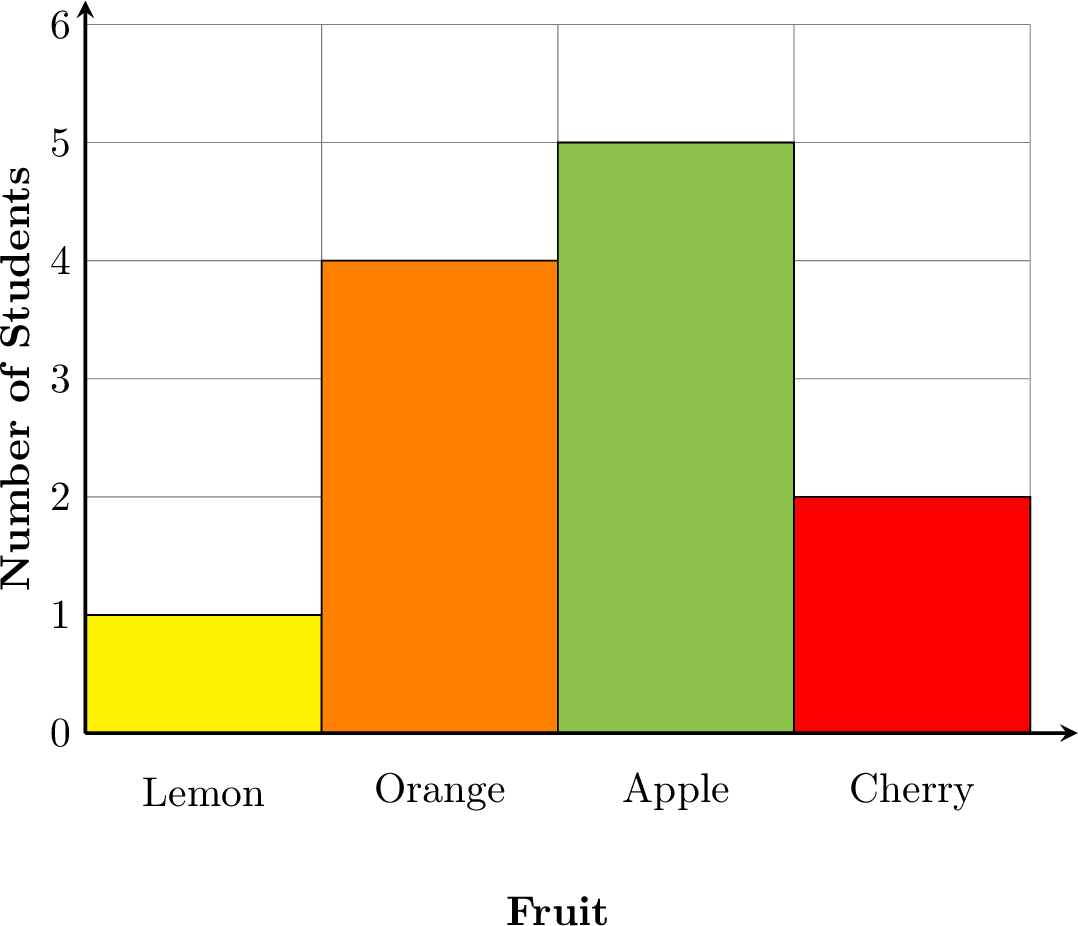
- How to Read the Bar Chart:
- Look at the bottom to see the categories (Lemon, Orange, Apple, Cherry).
- Look at the numbers on the side. They tell you “how many”.
- Find the top of a bar and follow it across to the number on the side to see its total.
- Check that the height of each bar matches the total in the tally chart.
- Let's Read Our Chart!
- Which fruit is the most popular? Apple, because its bar is the tallest (it reaches 5).
- Which fruit is the least popular? Lemon, because its bar is the shortest (it reaches 1).
- How many more students chose Apple than Cherry? Apple has 5 votes and Cherry has 2. So, \(5 - 2 = 3\) more students chose Apple.